A few things I wanted to share this week between events. Good things come in threes so let’s hop in.
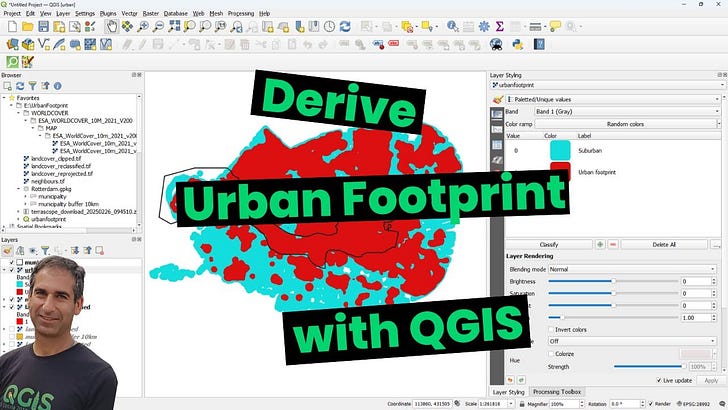
My friend and colleague Hans van Der Kwast has a great new video on deriving urban footprints with QGIS.
I explored a little bit while looking for urbanization in Goma, a border city in the DRC. This method probably works better with cities typically identified as urban centers but I did find interesting results.
First image shows the zoomed out urban area of Goma (tiny dot of red signifying a built-up landcover), a city struggling with refugee camps fleeing the violence in Rwanda, mining communities and refugee camps in addition to an outbreak of mpox infections.


If you aren’t familiar with TerraScope, Hans used this to find his base layer in the Netherlands. The density of the urbanization in Goma does not yield the best results for isolating urban footprints but this is an important tool for the toolbox. Final steps create a density map where you can generate a histogram and drill down deeper into defining your threshold for comparisons of urban density.
I discovered this little app called napkin.ai
It does a great job of generating little doodley graphics for your text.
For example, below is a snippet of text for an article I wrote.
Pasting it into napkin.ai and you get what I imagine is the equivalent of the back of a napkin doodle you might do as you map some ideas.